The Gaygency · Brand Exploration · Round Two
Capital & Change
A podcast on money, markets, and the forces that move them — hosted by Remy Blaire, recorded inside Rockefeller Center. Four directions below, built from your notes: Art Deco drawn from the architecture, cover art in candlestick charting, and bright magenta — used at a different volume in each.
Remy Blaire · New York Stock Exchange
From the shoot
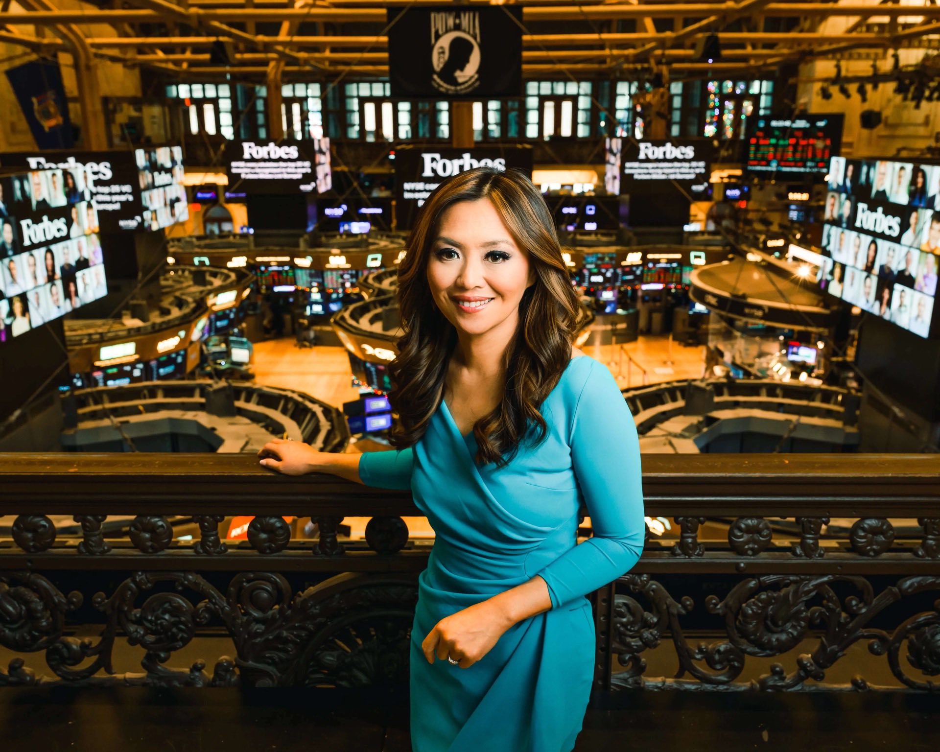
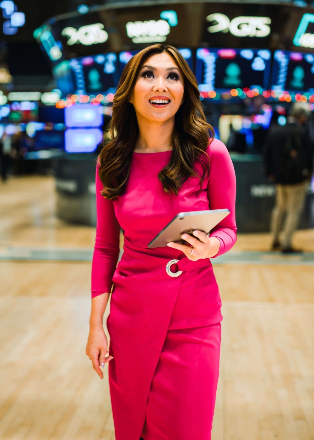
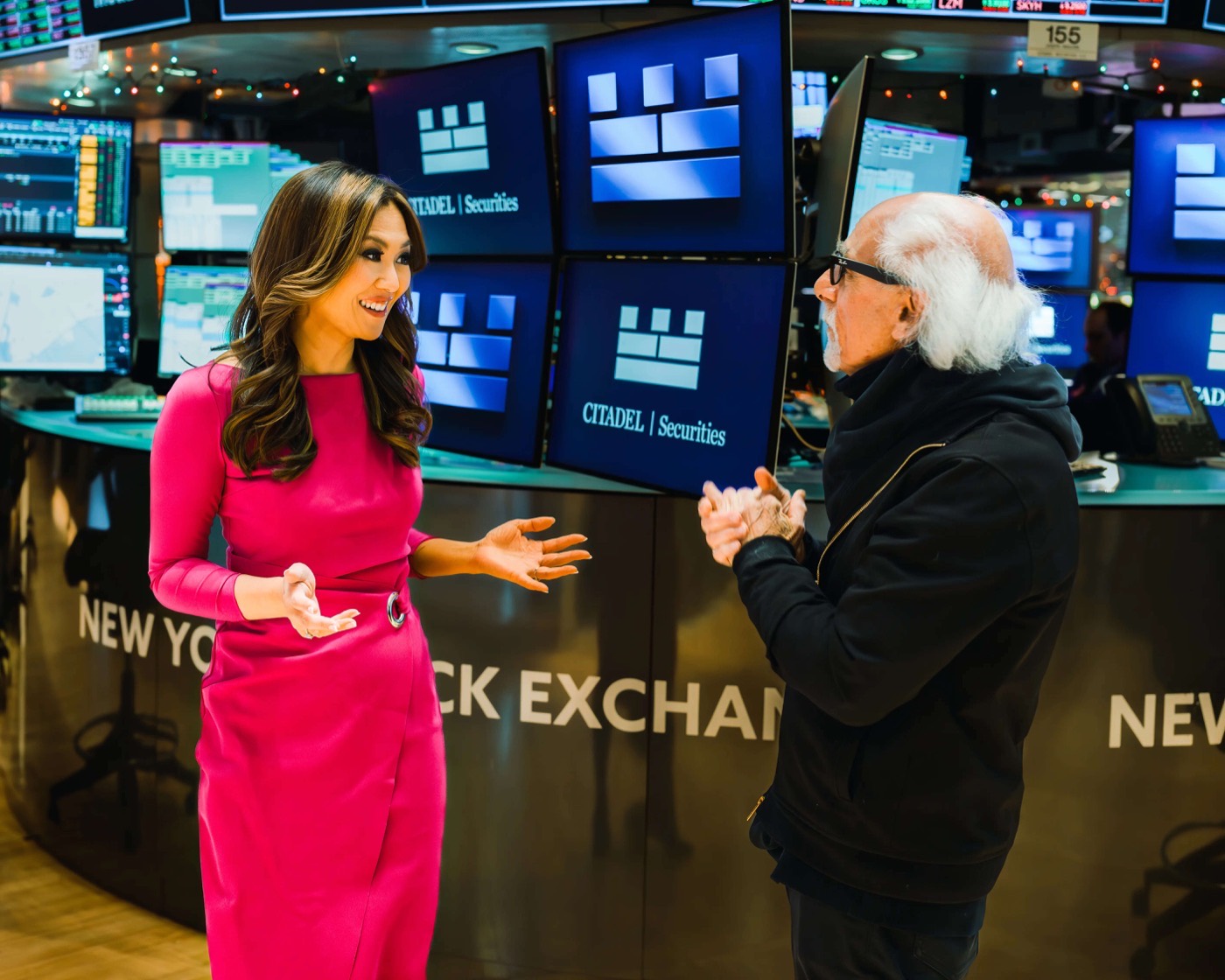
The magenta was already on the floor
These photographs are from Remy's shoot at the New York Stock Exchange. The dress is the bright magenta this round is built around — the color already belongs to her on camera.
Each direction below uses it at a different volume:
- IVA hint
- VA beacon
- VIThe masthead
- VIIIn the paper
The Synthesis
Classic Deco · Candlestick Markets · A Hint of MagentaPalette
Ivory · the ground
Antique Gold
Onyx · the ink
Magenta · the hint
Typography
Episode cover art · 3000 × 3000
Direction IV applied to the shoot photography
Everything you pointed to, in one frame, on a bright ivory ground so the magenta can sing. The architecture's onyx and antique gold draw the markets in candlesticks rising toward a single magenta close. The magenta appears exactly where it counts, so it stays a signature rather than a theme, and sets the brand apart from every dark navy-and-gold finance design on the shelf.
Your call · IV — The Synthesis
The Beacon
Setback Tower · Champagne & Gold · Magenta at the CrownPalette
Champagne
Antique Gold
Onyx
Beacon Magenta
Typography
Episode cover art · 3000 × 3000

Direction V applied to the shoot photography
The setback silhouette of 30 Rock, rebuilt as a market: the tower steps up in gold candlesticks and the center candle carries the magenta beacon at its crown. The champagne ground keeps the palette bright, and the caps-only lettering comes from 1930s building signage.
Your call · V — The Beacon
The Editorial
Fashion Serif · Ink on Paper · Magenta ForwardPalette
Paper
Ink
Gold Hairline
Magenta
Typography
Episode cover art · 3000 × 3000

Direction VI applied to the shoot photography
The most magenta of the four. A high-contrast fashion serif sets the masthead, hairline rules organize the frame, and the chart is etched in ink with the closing candle in full magenta. Of the set, this is the direction furthest from the navy-and-gold covers that fill the finance shelf.
Your call · VI — The Editorial
The Blush
Magenta in the Paper · Thin-Line Deco · QuietestPalette
Blush Paper
Plum
Gold
Magenta
Typography
Episode cover art · 3000 × 3000
Direction VII applied to the shoot photography
The quietest use of the color: the magenta moves into the paper itself as a pale blush ground, with gold hairline arcs from the deco fan and thin-line lettering. The chart is drawn in deep plum and closes on one full-strength magenta candle.
Your call · VII — The Blush
Choosing a direction
All four directions come from the same brief — the Art Deco of Rockefeller Center, cover art drawn in candlestick charting, and bright magenta to set the brand apart. They differ in how loudly the magenta speaks and how the market is drawn. Direction IV is our recommendation. Pick one, or tell us what to take from which, and we will develop it into the full identity: logo suite, final cover art, episode templates, and social.